In Living Color
What do our eras’ color schemes tell us about America—and about ourselves?

By James Lileks
Here’s my theory, inexpert and completely subjective: People have affection for the color schemes of their early childhood and an unreasonable hatred for the schemes of their adolescence. The reasons would seem simple. The grade-school hues are part of a happy time lost in the mists of time, and the high-school-era hues are rejected because you’re an opinionated adolescent who must castigate the world because it’s, like, lame, and because your parents like it.
The first time I considered that my thesis against the palette of the late ’60s and early ’70s might not be empirically correct was when I published an article about the regrettable hues of the ’70s and got a nice letter from an older lady, written on pastel-hued lined paper with a cartoon drawing of a kitten in the corner. It was in the careful cursive of women who were schooled in the 1940s. After a short preamble about appliances in the Nixon era, she stated simply that she liked avocado and harvest gold, and so had everyone else.
Well, of course you did, I thought; people are swayed by the insistent winds of fashion and bend to the messages of the advertisers. But then I realized I hadn’t considered whether her preferences were not only common, but correct. What if it was a good combo? What if I was wrong? What if avocado and harvest gold were actually one of the most important color combinations of the 20th century?
We can actually answer that question, and we will, at the end of our chat. But first, we need to discuss the matter of beloved color combos of the post-war 20th century, and why the 21st century has had such unsettling, unnatural hues threading through its entertainment and advertising. (Keep in mind that “decades” are inexact demarcations; the dominant trends start late in the decade and usually spill over into the next. Also, remember those key words: inexpert and subjective.)

The 1950s. Bright new hues predominated. Pink, turquoise, seafoam green, robin’s-egg blue. Colors that could be found in nature, but looked as if they came out of a lab. Science will make life gayer!—in the old “happy” sense. If you study the linoleum ads, there’s not a color they didn’t use, but the real giveaway is the bathroom fixture and tile ads. They’re the colors of an Easter bonnet. Why not a yellow toilet? Why not a pink tub?
We’ve retconned the ’50s to be a carefree, madcap decade, where Elvis did the hula-hoop on TV and every car had tail fins. But it was a nervous decade, what with the Bomb, decaying cities, the occasional economic contraction, and a rising youth culture of ungrateful juvenile delinquents that alarmed the Olds. In retrospect it looks cheerful enough, though, thanks to pastel palettes that implied a perpetual morn in May.

The 1960s. In the early part of the decade, deep red. The reign of harvest and avocado would begin in the latter years, but the ’60s might be best summed up with a color combo you might not associate with the counterculture, or the over-culture, or TV shows, or movie credits: green and yellow. Those were the colors of the Great Sign of the Holiday Inn chain. The sign had its origins in the ’50s, but by the ’60s it was ubiquitous nationwide and implied an understood good: standardization. The power—and reliability—of the corporate image. Perhaps it had assumed so large a part of the American psyche that its metamorphosis into the harvest gold and avocado scheme seemed like a way to bring the lure of the open road into your kitchen!
(Probably not.)

The 1970s. So much variety. There was orange, orange-brown, brownish orange, golden brown, light brown, burnt orange, dark gold, rust, burnt rust, dark wheat and so on. Also: chrome!
Why? That’s the question. The answer is usually pat. Imagine a droning filmstrip narrator: “In a time of national decline, political scandal and military defeat, the nation’s dolorous mood turned to earthier tones to represent a desire to return to nature, as well as to mirror the murky, downbeat mood of the American people.”
Right. Except that the fashionable hausfrau heating the fondue glop might have been wearing something bright and mod, with big plastic earrings and a necklace strung with lime-green golf balls. The ’70s were lousy, but people didn’t slouch around in hairshirt serf-smocks.

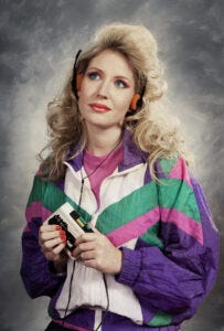
The 1980s. Eventually the ’80s will be seen entirely through revived ’50s colors—the hues of “Miami Vice.” Pink and turquoise. A few photos of some ur-’80s McDonald’s with glass block walls, some angular shapes, a dash of neon—that’s the entire decade, right?
Not at all. Oh, you could find those colors in the hip spots, and even in an orthodontist’s office renovated in 1986. But the palette was as wide-ranging as usual. If there was anything that set it apart, it was the brightness of the tones: America’s back! Life’s good! You could make the point that red and black was the dominant duo, simply because that’s what Michael Jackson wore and everyone copied him. But it’ll be the pastel pink and muted turquoise that will tell someone in 2040 that this show was set in the ’80s. That, and some guy playing saxophone in a rainy alley with a neon beer sign in the background.

The 1990s – August 1998. Here it gets a little hazy. I’m not saying there weren’t fashionable colors; there are always fashionable colors. Office decor was beige and puce, like the decomposing corpse of the ’80s. But something happened toward the end of the 20th century. It seemed as if we had collectively decided not to do anything new, but remix all the things that came before. This might have been a reaction to the early ’90s grunge aesthetic: It was so downbeat and mopey and unkempt that people took interest in previous eras that had a bit more get-up-and-go.
The ’90s had a minor fad for both swing and swank. Big band music was suddenly cool, and record labels reissued the ’50s and ’60s mood music that suburban dads put on their hi-fi systems. It felt grown-up and grounded, and as we headed into the 21st century, we wanted to tie ourselves to a firm stake before the gales of the new era hit. So all the colors came back. If there was any unusual color, it was the sickly green of “The X-Files” logo, which stood in for the silly paranoia we ginned up for amusement.
Everything changed on August 15, 1998.
On that auspicious day, Steve Jobs introduced the iMac computer. It was “Bondi Blue” and cloudy, skim-milk white, and in an instant, it redefined the cultural palette. Everything suddenly had to be blueish-whitish to have modern bona fides, and I think I knew the craze had reached its apogee when I saw a blue-white plastic appurtenance on a George Foreman grill.

The 21st century, and its restless boredom. Our current era is marked by starkness and minimalism. The Apple store’s ascetic white-and-wood interiors. Neutral-toned boxes have replaced the colorful, old, mansard-roofed McDonald’s. You can get people’s attention with colors in this culture, but alas, our colors are somewhat bizarre.
Last year, a horrid color swamped television ads: a metallic teal-blue hue that was sometimes bright, sometimes dark, but always unnatural. Like the Facebook blue if Facebook were run by Terminator robots. (Which it probably isn’t.) Once you noticed it, you couldn’t stop seeing it everywhere. It made the world feel off, askew, unreal—the color of the soul of a social media hive mind.
Why? It was regarded as fashionable by the ad makers, something new that caught the eye, and everyone else copied it, probably adjusting the hues in ads already made just to seem zeitgeisty. It’s already on the way out—but you suspect that the next hue will suddenly be ubiquitous, pervasive and unescapable, the color of the limbic fluid of the mass-media brain. Like the devolution of logos from unique and ornate to stark and sans-serif, it flattens everything out into a consistent experience of consumerism.
What’s coming next? Hard to say. A lot of my apps—travel apps in particular, for some reason—are soaked in orange, and this might be some long-buried part of the national psyche resurfacing. After all, the most influential color combination of the previous century might have been from the 1930s. Lurid orange and blue, or its variant, orange and turquoise. These were the colors of the World’s Fair of 1939.
That might have been a death sentence for a color combo, since the futuristic optimism of the Fair curdled fast in the heat of World War II. But they were also the hues of two emissaries of nationwide culture: Howard Johnson’s and Rexall Drug. The latter would put up signs in towns across the nation, and they lasted a very long time. When I moved into my Minneapolis neighborhood in the mid ’90s, there was a corner drugstore that still had the classic livery.
HoJo built restaurants and motels that lined the new highways and connected the color combo with the new era of mobility, car culture and space-age ahistorical American exceptionalism. No other culture could come up with these structures, with their fantastic pointy lobby buildings with orange roofs and spindly turquoise weathervanes, marrying modernity and tradition in a promise of ice cream and a clean bed.
It’s a distinctive pair, but it’s a bit much. No one wants an orange coffin with a turquoise lining. But a harvest gold box with an avocado interior? More apt, perhaps. As noted before, those notes of an autumn sunset might have been popular in the ’70s because they rhymed with the national mood of resignation and decline, and that’s why they found their way into kitchens across America.
Or, because Mom liked them because they were new and different. Nothing more to it than that. Good times or glum, it’s always America, and new and different is baked in our DNA. When in the course of human events it becomes necessary to redo the shelf paper, it’s the fresh hue that sells.
Your kids will probably hate it for a while. But when it comes around again, they might feel different. I’m not saying I love harvest gold and avocado. I am saying that I understand it. And I miss it a little, too.

